
Display settings — how every product box looks, links and discloses.
Five short screens that decide the look and the compliance of every product box, table and button on your site. Set them once and every shortcode you ever publish follows them.
The 60-second version. Everything in it is written out below, with each field marked on the screen it belongs to.
What you will have when you finish
- Buttons that say what you want and look like your theme, on every box at once.
- Affiliate links that open the way you choose and carry the right rel attribute.
- An affiliate disclosure attached automatically to every shortcode.
- Ad networks blocked from breaking your product layouts.
- Optional related-article cards that keep readers moving through your site.
Where this sits in the series. Part 1 got the plugin installed and connected to Amazon. Part 2 set up the AI keys and models. This one is about presentation — nothing here needs an API key, so you can do it on day one.
Open Affiliate Pro → Display. Five items sit in the left-hand list, and between them they control every product box, comparison table, list and button the plugin renders. These are global defaults: change one here and every shortcode you have already published changes with it, with nothing to edit post by post.
Display Options — links and buttons
The first screen decides how your affiliate links behave and what the buy button looks like.

| Setting | What it does | What to pick |
|---|---|---|
| Link Target | Whether an affiliate link opens in a new tab or replaces your page. | New Tab. Your article stays open behind the reader, so they can come back and click a second product. |
| Nofollow Links | Adds rel="nofollow" to affiliate links. | Leave it on. Affiliate links are paid links, and search engines expect them to be marked. It costs you nothing. |
| Button Text | The words on every buy button, everywhere. | Something that names the destination — See on Amazon, Check price on Amazon. Naming the store sets the reader’s expectation before they click. |
| Button Icon | The small mark before the text. | See below — this one has a compliance angle. |
Which button icon to choose
There are three options, and the screen itself explains the trade-off. Worth reading properly, because one of them carries a risk the other two do not.
🛒 Shopping cart recommended
Generic commerce iconography that belongs to nobody. Your button text does the job of naming the store, and referring to Amazon by name in text is expressly allowed.
🏷 Amazon-style badge
Offered because many site owners want it — but it is a recreation, not an official Amazon asset. Amazon’s trademark guidelines cover its actual logo files under permission, and they do not bless approximations drawn by a third party.
◯ No icon
A plain text button. The cleanest fit for a minimal theme, and it makes the button read as part of your design rather than as an advert.
If your Associates account matters to you, use the cart. It carries no trademark question at all, and the preview above the note shows you exactly what the finished button looks like as you change the setting.
Features, Ad Guard and item count
Scroll down the same screen. Three more settings, and the middle one solves a problem most affiliate publishers only notice after it has been costing them for months.
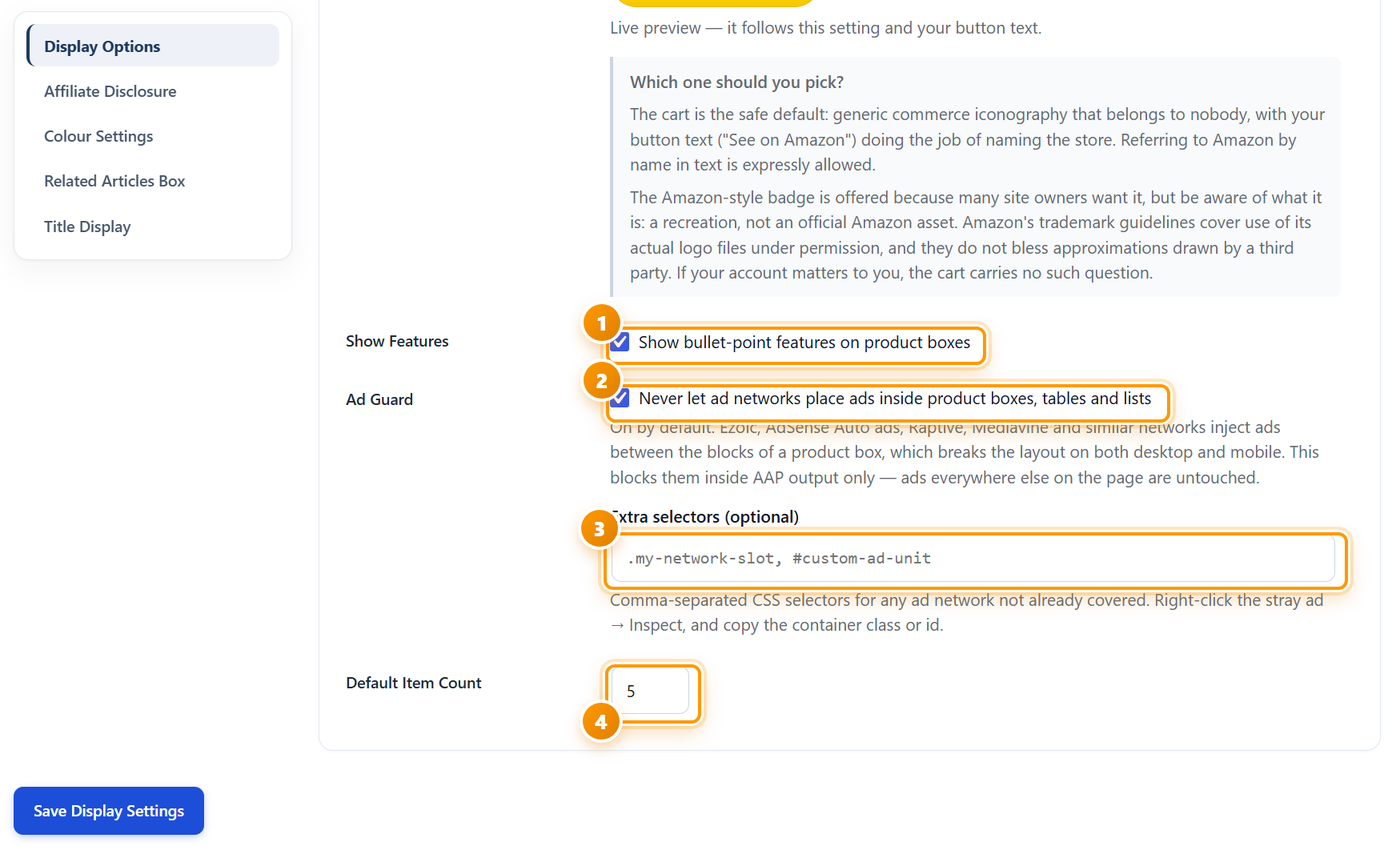
Ad Guard — why it is on by default
Ezoic, AdSense Auto ads, Raptive, Mediavine and similar networks inject ads between the blocks of a page. When one lands in the middle of a product box, it splits the image from the title from the button, and the layout breaks on both desktop and mobile. The reader sees a broken box and does not click it.
Ad Guard blocks that from happening inside plugin output only. Ads everywhere else on the page are untouched — your revenue from display advertising is not affected, only its ability to land inside a product box.
If a stray ad still appears inside a box, its network is not one of the ones covered by name. Right-click the ad → Inspect, copy the container’s class or id, and add it to Extra selectors as a comma-separated list — for example .my-network-slot, #custom-ad-unit.
The other two
- Show Features puts the bullet-point feature list on product boxes. Leave it on for review posts, where the specifics help a reader decide. Turn it off if you want compact boxes in a long roundup.
- Default Item Count is how many products a list or table shows when the shortcode does not say otherwise. Five is a sensible default — long enough to be useful, short enough that nobody scrolls past it.
Affiliate Disclosure
This is the only screen on the tab that is not a matter of taste. Amazon’s Associates programme requires you to disclose the relationship, and so does the FTC in the US and equivalent rules elsewhere.

Switch it on and forget it. The disclosure is attached to every shortcode automatically, so a post you write in a hurry two years from now is covered without you remembering to add anything.
The default text — “As an Amazon Associate I earn from qualifying purchases.” — is the wording Amazon itself asks for, so there is rarely a reason to change it. If you do rewrite it, keep the meaning: readers must be able to tell you earn from the links.
For Position, above the product is the more conservative choice, because the reader sees it before they click rather than after. Below keeps the box visually tighter. Either satisfies the requirement; pick the one that suits your layout.
Colour Settings
Six colour pickers that make product boxes look like part of your site instead of something bolted onto it. This is the single highest-impact screen on the tab: a box that matches the theme reads as a recommendation, and one that does not reads as an advert.

| Colour | Where it shows | How to choose it |
|---|---|---|
| Primary / Button | Every buy button. | Your theme’s call-to-action colour, or the classic Amazon orange. Whichever you pick, use it consistently — a button colour becomes a signal readers learn. |
| Primary Hover | The button while the cursor is on it. | A shade or two darker than the button. The change is what tells a reader the button is live. |
| Card Background | Behind the whole product box. | White, or a hair off your page background so the box lifts slightly off the article. |
| Card Border | The box outline. | A light grey. A heavy border makes boxes shout; a subtle one just separates them. |
| Product Title | The product name. | The same colour as your article body text, so it reads as content. |
| Button Text | The words on the button. | Whatever is readable on your button colour — dark text on a light or orange button, white on a dark one. This is the one to check twice. |
Check the contrast, not just the look. Pale text on a pale button passes design review on a bright monitor and disappears on a phone in daylight. If in doubt, go darker.
Related Articles Box
One checkbox that adds a “Keep reading” card between sections of every post on the site — a two-column card with a thumbnail and title for each linked article, matched by category and tag.
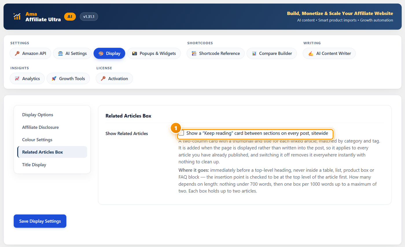
Why it is safe to switch on
The card is added when the page is displayed, not written into the post. Two things follow from that, and both matter:
- It applies immediately to every article you have already published — you do not go back and edit anything.
- Switching it off removes it everywhere instantly, with nothing left behind to clean up.
Where the card goes
Placement is the part people worry about, and the rules are deliberately cautious:
- It is inserted immediately before a top-level heading — never inside a table, list, product box or FAQ block. The insertion point is checked to be at the top level of the article first.
- How many depends on length: nothing at all under 700 words, then one box per 1,000 words, up to a maximum of two.
- Each box holds up to two articles.
What it does for you: a reader who finishes one of your reviews is your best prospect for the next one. Internal links between related articles also help search engines understand which of your pages belong together — which is exactly what a topic cluster is.
Title Display
One field, and a fix for something that quietly makes every product box look untidy.

Amazon product titles are written for Amazon’s own search, not for your layout. A single title can run to twenty words of model numbers, colours and pack sizes, and in a comparison table that wraps to four lines and pushes everything out of alignment.
Set a limit and the title is cut to that many words followed by an ellipsis. 8 to 10 works well — enough to identify the product, short enough to keep a table’s rows the same height. Set 0 if you would rather show the full title.
Check a comparison table after changing this. Tables are where long titles do the most damage, so they are the fastest way to see whether your number is right.
Press Save Display Settings. One button saves all five screens.
A sensible starting point
If you would rather not think about every field, these settings work for most affiliate sites and you can refine them later.
| Setting | Start with |
|---|---|
| Link Target | New Tab |
| Nofollow Links | On |
| Button Text | See on Amazon |
| Button Icon | Shopping cart |
| Show Features | On |
| Ad Guard | On |
| Default Item Count | 5 |
| Show Disclosure | On, below product |
| Colours | Your theme’s CTA colour for the button, white card, light grey border |
| Related Articles Box | On, once you have more than a handful of posts |
| Max Title Words | 8 |
If something does not look right
| What you see | What it usually means | What to do |
|---|---|---|
| A change here did not appear on the site | Page caching | Clear your caching plugin and your CDN. These are global settings and take effect immediately once the cached page is regenerated. |
| Button text is unreadable | Button Text colour against Button colour | Change Button Text Colour in step 4. Check it on a phone, not only on your monitor. |
| An ad still lands inside a product box | That network is not covered by name | Inspect the ad, copy its container class or id, and add it to Extra selectors. |
| Comparison table rows are different heights | Long Amazon titles | Set Max Title Words to 8 or 10. |
| No disclosure is showing | Show Disclosure is off, or the theme strips it | Switch it on and save. If it still does not appear, check whether your theme filters shortcode output. |
| No related-articles card appears | The post is too short, or has no top-level heading | Under 700 words nothing is inserted, and the card only goes before a top-level heading. Both are by design. |
| Boxes look nothing like your theme | Default colours | Work through step 4. It is the one screen that changes how boxes feel more than any other. |
What to do next
Set up the widgets
Popups & Widgets adds the exit-intent popup, the floating bar and the scrolling ticker — the three placements that earn outside the article body. That is the next guide.
Publish a product box
Now that the styling is settled, grab a shortcode from Shortcode Reference and drop an ASIN in. It will already look the way you just decided.
See the whole product
New here? What is Ama Affiliate Pro covers every feature and how the pieces fit together.
Frequently asked questions
Do these settings change posts I have already published?
Yes, and that is the point. They are sitewide defaults applied when a page is rendered, so a change here updates every existing product box, table and list at once. Nothing is written into the post content, so there is nothing to edit or undo post by post.
Can I override the settings for one particular box?
Yes. Shortcode attributes take priority over these defaults, so a single box can use a different item count or button text while everything else follows the global setting. The Shortcode Reference tab lists what each shortcode accepts.
Is the Amazon-style badge safe to use?
It is a recreation, not an official Amazon asset. Amazon’s trademark guidelines cover the use of its actual logo files under permission and do not bless approximations drawn by a third party. If your Associates account matters to you, the shopping cart icon carries no such question — and naming Amazon in your button text is expressly allowed.
Will Ad Guard reduce my advertising revenue?
No. It only blocks ad insertion inside plugin output — product boxes, tables and lists. Ads everywhere else on the page are untouched. What it prevents is an ad landing mid-box and breaking the layout, which costs you affiliate clicks.
Do I really need the affiliate disclosure?
Yes. Amazon’s Associates programme requires you to disclose the relationship, and consumer-protection rules in the US and many other countries require it independently. Switching it on here attaches it to every shortcode automatically, so it is one less thing to remember.
Where exactly does the related-articles card appear?
Immediately before a top-level heading, and never inside a table, list, product box or FAQ block. Posts under 700 words get none; longer posts get one box per 1,000 words up to a maximum of two, and each box holds up to two articles.
What is a good Max Title Words setting?
8 to 10. Enough to identify the product, short enough that a comparison table keeps its rows the same height. Set 0 for no limit if you would rather show full Amazon titles.
Is the Display tab the same in Ama Affiliate Ultra?
Yes. The tab, the five screens and every field are identical in both products.
Set the look once, apply it everywhere
Every product box, table and button on your site follows these settings — including the ones you published last year. Every plan includes every feature and a 14-day free trial.
See plans & start free